
Have you ever stood in front of your closet or stared at your living room wall and wondered, “Do green and brown actually go together?”
Here’s the thing — this color combo might not sound exciting at first, but it’s one of the most natural, balanced, and surprisingly stylish pairings out there.
Think about it. Trees, forests, and earthy landscapes — everywhere in nature, green and brown live side by side. That’s why this combo feels calm, grounded, and timeless. From fashion to home decor, these two colors can bring out warmth, freshness, and balance when used thoughtfully.
In this guide, we’ll talk about why green and brown work so well together, how to use them in clothes, interiors, and even branding. You’ll also get easy style tips, examples, and color palette ideas you can actually try.
Snippet-Ready Definition:
Green and brown go together perfectly because they mirror nature’s balance — trees, soil, and leaves. This natural pairing creates a calming, timeless combination that works beautifully in fashion, home decor, and design.
Why Green and Brown Work So Well Together
Inspiration from Nature
When it comes to harmony, nature always wins. Green and brown are nature’s favorite duo — leaves and bark, plants and soil, moss and tree trunks. This combination feels familiar because we see it all around us every day. It’s what designers call an “earth tone palette,” and it instantly creates a sense of calm and connection.
That’s why you’ll notice earthy green and brown themes in cozy cafes, eco-friendly product packaging, and outdoor-inspired fashion. The human eye naturally finds this mix relaxing because it mimics natural surroundings.
If you want to create balance in your outfit or room, just think about a forest — that’s the color story you’re aiming for.
The Science of Color Harmony
From a design perspective, green and brown belong to the same warm, organic color family. Green is a mix of blue and yellow, while brown comes from red mixed with darker tones. When these two meet, they create a low-contrast, grounded combination that’s pleasing but not boring.
Here’s how it works:
- Warm greens like olive or moss pair beautifully with warm browns like chocolate or chestnut.
- Cool greens such as mint or sage look great with cooler browns like taupe or sand.
- Add a neutral (like white, cream, or beige) to make both colors pop gently.
Lighting also plays a big role. Under warm light, the tones blend softly. In cool daylight, the green stands out more, giving a fresh, lively effect.
The Psychology Behind the Pairing
Colors have feelings — or at least, they trigger emotions.
Green often represents growth, peace, and renewal, while brown stands for stability, comfort, and dependability. When you combine them, you get something that feels balanced — fresh but safe, natural yet refined.
That’s why brands focused on sustainability and wellness love using green and brown. It communicates that they’re eco-friendly, honest, and rooted in nature.
If you’re trying to make your space or wardrobe feel more grounded, this color pairing does the job perfectly.
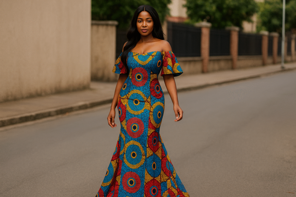
Green and Brown in Fashion and Outfit Ideas
Let’s be honest — matching clothes can be tricky. Some colors clash, others feel dull. But green and brown? They hit that sweet spot between subtle and bold. The best part is, they work across seasons and skin tones.
Do Green and Brown Go Together in Clothes?
Absolutely!
Whether you’re putting together a casual outfit or something more dressed up, these colors complement each other easily. In fashion, they’re considered “earth tones” — meaning they look good on almost everyone.
For a balanced look:
- Pair an olive-green top with chocolate-brown pants for a rich, autumn-inspired outfit.
- Try a forest green dress with tan boots for a relaxed weekend look.
- Match khaki brown trousers with a sage-green shirt for a professional, nature-inspired vibe.
And here’s a quick tip: if both pieces feel too strong, tone it down with a neutral layer like beige, white, or denim.
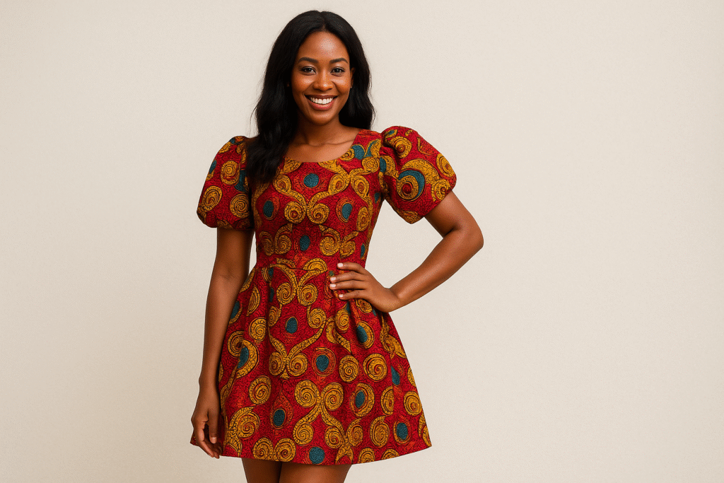
Dark Green and Brown Combination Outfit
Dark green and brown create a classy, luxurious feel. Think of deep forests or coffee-colored leather — elegant and effortless. This combo looks fantastic in fall and winter because both colors have depth and warmth.
Ideas you can try:
- Dark green blazer with brown trousers for business casual days.
- Chocolate leather jacket with a forest green turtleneck.
- Deep green maxi dress with a brown belt and boots.
Adding gold accessories or tan highlights makes this combo even richer without overpowering it.
Light Green and Brown Combination Outfit
If you prefer softer tones, light green and brown bring a refreshing, spring-like vibe.
Try mixing mint green, sage, or pistachio with light tan, camel, or beige. These combos feel clean, airy, and cheerful — perfect for warmer months.
Here are a few pairings that always work:
- Mint green blouse with light brown skirt.
- Sage pants with beige sandals.
- Light green t-shirt and tan shorts for a casual day look.
You can also mix textures — linen, suede, or cotton — to add dimension without adding extra color.
Green and Brown in Interior Design and Home Decor
If you’ve ever wanted your home to feel calm, cozy, and a little closer to nature, green and brown might be the combo you’ve been missing. It’s not flashy or trendy in a loud way — it’s timeless, earthy, and peaceful. The best part is, this palette fits into almost any style, from modern to rustic.
Green and Brown Color Scheme for Living Room
Imagine walking into a living room with soft sage-green walls and walnut-brown furniture — it instantly feels warm, inviting, and balanced. That’s because this pairing mirrors nature’s own balance: greenery supported by solid earth tones.
Here are a few ways to bring that look into your home:
- Use olive or moss-green paint with medium to dark wood furniture.
- Mix light brown leather sofas with forest-green throw pillows or a patterned rug.
- Add a cream or beige accent to brighten up the space and prevent the colors from feeling too heavy.
If your living room has a lot of natural light, go for deeper shades like forest or hunter green. In smaller, darker spaces, stick to lighter tones like sage or mint so the room doesn’t feel closed in.
Applying Green and Brown in Other Rooms
This combination doesn’t just belong in the living room. You can carry it through the rest of your home for a cohesive, natural flow.
- Bedroom: Soft greens like pistachio paired with wooden furniture create a calm, restful feel. Add a linen duvet or jute rug for texture.
- Kitchen: Try olive-green cabinets with walnut or oak counters for that earthy farmhouse charm.
- Bathroom: Go for sage tiles and light brown wooden shelving for a spa-like touch.
When decorating, remember that lighting can completely change how these colors look. Warm light makes them cozier; cool white light makes them fresher and more modern. Always test your paint or fabrics in your room’s natural lighting before deciding.
Supporting Colors, Textures, and Materials
If you’re worried green and brown might look too monotone, here’s the secret — it’s all about texture.
Layer different materials to make your space feel rich and intentional.
- Add rattan baskets, linen cushions, or jute rugs to create depth.
- Use gold, brass, or matte black accents for a polished contrast.
- Sprinkle in neutral shades like beige, off-white, or soft gray to balance warmth and freshness.
And here’s a pro tip: a splash of terracotta, mustard yellow, or muted gold can lift the palette and keep it from looking too flat. These tones complement both green and brown beautifully.
Real-World Example: Nature-Inspired Minimalism
A recent design trend called biophilic design focuses on bringing the outdoors inside. Designers use green and brown to mimic forests and natural landscapes, helping people feel more relaxed and connected. You’ll see this in cafés with mossy green walls and reclaimed wood furniture, or offices using plant walls and oak desks to reduce stress.
That’s the magic of this combo — it not only looks good, it feels good.
Practical Tips and Common Mistakes to Avoid
Even though green and brown are natural partners, a few styling mistakes can throw off the balance. But don’t worry — they’re easy to fix once you know what to watch for.
Common Mistakes People Make
- Using colors that are too similar: If both shades are too dark or too muted, they can blend into each other. Add a neutral or lighter tone to break things up.
- Ignoring undertones: Warm greens (like olive) clash with cool browns (like grayish taupe). Stick with matching undertones — warm with warm, cool with cool.
- Skipping accent colors: Pure green and brown can feel heavy on their own. Add cream, beige, or even a metallic accent for balance.
- Overdoing it: You don’t need everything to be green or brown. Use one as your main color and the other as support.
Think of it like a relationship — one color should lead, and the other should complement.
How to Test the Pairing Before You Commit
Here’s a trick decorators and stylists swear by: the small-swatch test.
Before painting a wall or buying new furniture, test small samples of your green and brown choices under your room’s lighting at different times of day.
If it feels too dark or dull, lighten one of the shades or add neutral accents. You can also make a quick mood board — collect fabric swatches, magazine cutouts, or photos to see how everything feels together.
Another easy way? Start small. Add a green pillow to your brown couch or hang a brown frame on a green wall. See how it feels before going all in.
Expert Advice and Real-World Examples
Interior designers love this combination for its versatility. Many suggest using olive green as a new neutral — it’s softer than black and pairs perfectly with brown’s warmth.
Take inspiration from well-known brands like Starbucks or The North Face — both use green and brown in their design and branding to express sustainability, comfort, and authenticity. That’s proof the palette communicates calm, trust, and earthiness across different spaces and styles.
Variations and Special Cases
Here’s the thing — once you start experimenting with green and brown, you’ll realize there’s not just one way to do it. Different shades can tell completely different stories. Some are cozy and traditional, others are fresh and modern. Let’s look at a few popular variations that people love.
Do Mint Green and Brown Go Together?
Yes, absolutely — but it’s all about balance. Mint green brings a cool, light freshness, while brown grounds the look with warmth. Together, they create a refreshing contrast that feels airy yet stable.
If you’re dressing up, try a mint-green blouse with tan pants or a brown leather bag — it’s soft but stylish. For interiors, mint walls with walnut furniture or a mint-green rug on hardwood floors give a light, modern vibe. It’s perfect for spaces you want to feel clean, fresh, and positive, like a kitchen or home office.
The trick is moderation. Too much mint can make things look cold, and too much brown can feel heavy. Combine them in small, deliberate doses.
Green and Brown in Branding and Design
You’ve probably noticed this color combo in logos and packaging for eco-friendly or outdoor brands — and that’s no coincidence. Green symbolizes nature and renewal, while brown represents dependability and authenticity. Together, they say, “We care about the earth, and you can trust us.”
Think of brands like Starbucks, Timberland, or The North Face — all use earthy tones to express a grounded, natural identity.
If you’re building a brand or designing a product, this palette is a smart choice to communicate sustainability and stability without shouting.
Even in website design, a green and brown color scheme can make your layout feel warm, organic, and welcoming. Add a few beige or white highlights, and it becomes visually clean while staying connected to nature.
Seasonal Adjustments and Trends
Here’s what’s fun — green and brown work all year round; you just have to switch up the tones.
- Spring and Summer: Go for lighter greens (mint, pistachio, sage) with soft browns (tan, beige, camel). These combinations feel breezy and relaxed.
- Fall and Winter: Deep greens (forest, emerald, olive) with rich browns (chocolate, espresso) create that cozy, layered look perfect for colder months.
In fashion, these transitions happen naturally — for example, a light green sundress with tan sandals in summer easily becomes a dark green sweater with brown boots in winter.
The same goes for interiors: switch out lighter decor for deeper tones when the seasons change, and your home will always feel in tune with nature.
Historical and Cultural Connection
Green and brown have been used together for centuries. In art, architecture, and traditional fashion, these colors represented the connection between humans and the natural world.
Ancient painters used earthy pigments — often made from minerals or plants — to create calming landscapes and realistic scenes. That’s why when we see these tones today, they still feel familiar and timeless.
Even in different cultures, the combination symbolizes harmony and balance — green for life and renewal, brown for strength and endurance. It’s a story that crosses borders and styles, and that’s what makes this pair so universally loved.
How Lighting Changes the Look
Lighting can completely transform how this pairing feels. Under warm lighting, green and brown become softer and cozier — great for bedrooms or reading nooks. Under cool white light, they appear crisp and modern, perfect for offices or kitchens.
If you’re experimenting with decor:
- Try warm LED bulbs to highlight brown tones and make the space feel more inviting.
- Use natural daylight to emphasize green shades and keep things fresh.
- Mix matte and glossy textures so light bounces around differently — this adds depth without needing more color.
Lighting can make or break a color scheme, so test how your greens and browns react before finalizing your design.
Using Patterns and Prints That Combine Green and Brown
If you want to take things up a notch, play with patterns.
Botanical prints, checkered fabrics, and abstract art pieces often use these two colors together beautifully.
For example:
- A green floral dress with brown sandals feels soft and feminine.
- Camouflage patterns combine multiple greens and browns for a bold, rugged look.
- In interiors, leaf-patterned curtains or cushions with brown wooden frames instantly create a nature-inspired aesthetic.
Just remember: when using bold prints, let the pattern shine and keep everything else simple. Too many textures or colors can make things look cluttered.
Comparison Table – Green vs Brown Harmony
| Aspect | Green | Brown | How They Work Together |
| Meaning | Growth, freshness, renewal | Stability, comfort, grounding | Balanced energy — calm yet strong |
| Tone Type | Cool to warm hues | Warm, earthy neutrals | Complementary earth-tone family |
| Fashion Use | Jackets, dresses, shirts | Shoes, belts, pants | Creates natural and stylish outfits |
| Interior Use | Walls, plants, textiles | Furniture, floors, decor | Feels cozy, organic, and timeless |
| Lighting Effect | Appears lively in daylight | Adds warmth in low light | Together = perfect room balance |
Quick Styling Tips (Bullet List)
- Match olive green with chocolate brown for a rich, fall-ready look.
- Pair mint green with tan for a light, airy feel.
- Mix sage green walls with walnut furniture for natural elegance.
- Use neutral accents like beige or cream to balance contrast.
- In branding, combine green and brown to express eco-friendliness and trust.
FAQs About “Do Green and Brown Go Together”
1. Do brown and green pair well?
Yes, brown and green pair beautifully because they naturally complement each other. This combination feels warm, earthy, and balanced — inspired directly by nature’s colors.
2. Do brown and green clothes match?
Absolutely. Green and brown clothes look great together when you choose shades with matching undertones — like olive with chocolate or mint with beige. Add a neutral accent for polish.
3. Do brown and green match well?
They do. These colors belong to the same earth-tone family, so they create harmony rather than contrast. Together, they bring calmness, warmth, and timeless charm to fashion and decor.
4. Are green and brown complementary?
Not technically on the color wheel, but visually, yes. They complement each other emotionally — green’s freshness blends with brown’s warmth, forming a grounded and relaxing aesthetic.
5. What colors go best with green and brown together?
Neutrals like beige, ivory, and white work best. You can also add terracotta, mustard, or gold for extra richness without overpowering the palette.
Final Thoughts – Yes, Green and Brown Go Together Perfectly
So, do green and brown go together? The short answer is yes — they don’t just go together, they belong together.
It’s one of those combinations that never really goes out of style because it feels natural, comfortable, and effortlessly elegant.
Whether you’re styling an outfit, designing a room, or building a brand, this color pairing always finds its balance.
- It’s calming yet confident.
- Modern yet timeless.
- Simple yet full of depth.
Here’s the best part: you don’t have to be a designer or stylist to make it work. Start small — throw a green cushion on your brown couch, pair your olive jacket with brown boots, or paint one wall a soft green next to your wooden furniture. You’ll be amazed how easily everything starts to click.
Color harmony isn’t about strict rules — it’s about feeling. And when it comes to green and brown, that feeling is calm, grounded, and beautifully real.
Disclaimer
This article provides general design and fashion guidance based on color theory and aesthetic principles. Results may vary depending on lighting, personal taste, and material selection. Always test colors in your specific setting before finalizing decisions.

Hi, I’m Bilal, the founder of outofmagazine.com. I love sharing fresh ideas, stories, and helpful insights on all kinds of topics that spark curiosity. My goal with this site is simple—to create a space where readers can find inspiration, useful tips, and engaging reads on lifestyle, trends, and everything in between.